Personal Finance Educator · Landing page concept
Money, Plainly
A friendly, trustworthy landing page for a finance newsletter that makes money topics feel simple.
- CREATOR
- Jonas Berg
- CATEGORY
- Personal Finance Educator
- DELIVERABLE
- Landing page UI
- YEAR
- 2026
Overview
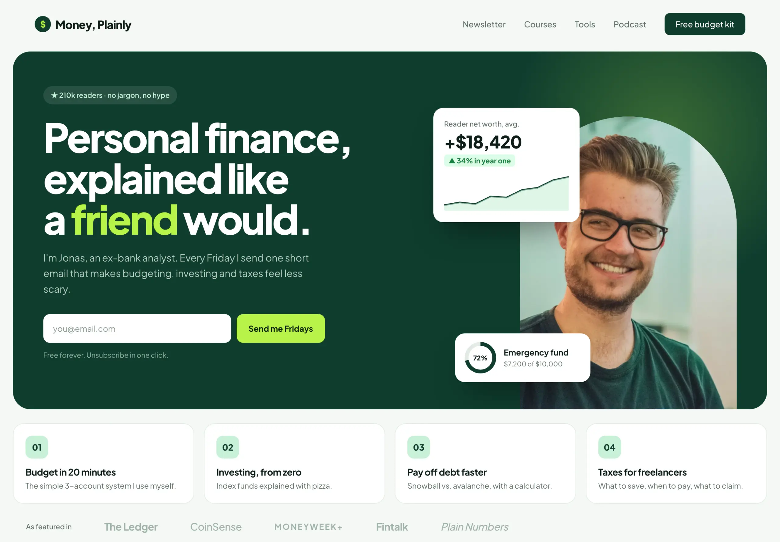
“Personal finance, explained like a friend would.”
A concept page for a finance educator growing a weekly newsletter. Money content can feel cold or hype-driven, so the brief was 'credible but human', with a single email signup as the main goal.
Design direction
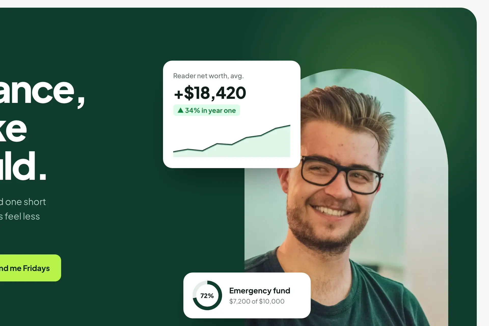
Deep forest green signals trust and money without the usual corporate blue, and a fresh lime accent keeps it approachable. A smiling portrait in an arch sits beside floating UI cards (net-worth chart, savings goal ring) that make the topic tangible. Numbered topic tiles show what readers will learn.
The problem
Finance content sits between cold institutional and loud hype, and readers distrust both. The signup had to feel like a recommendation, not a funnel.
What we did
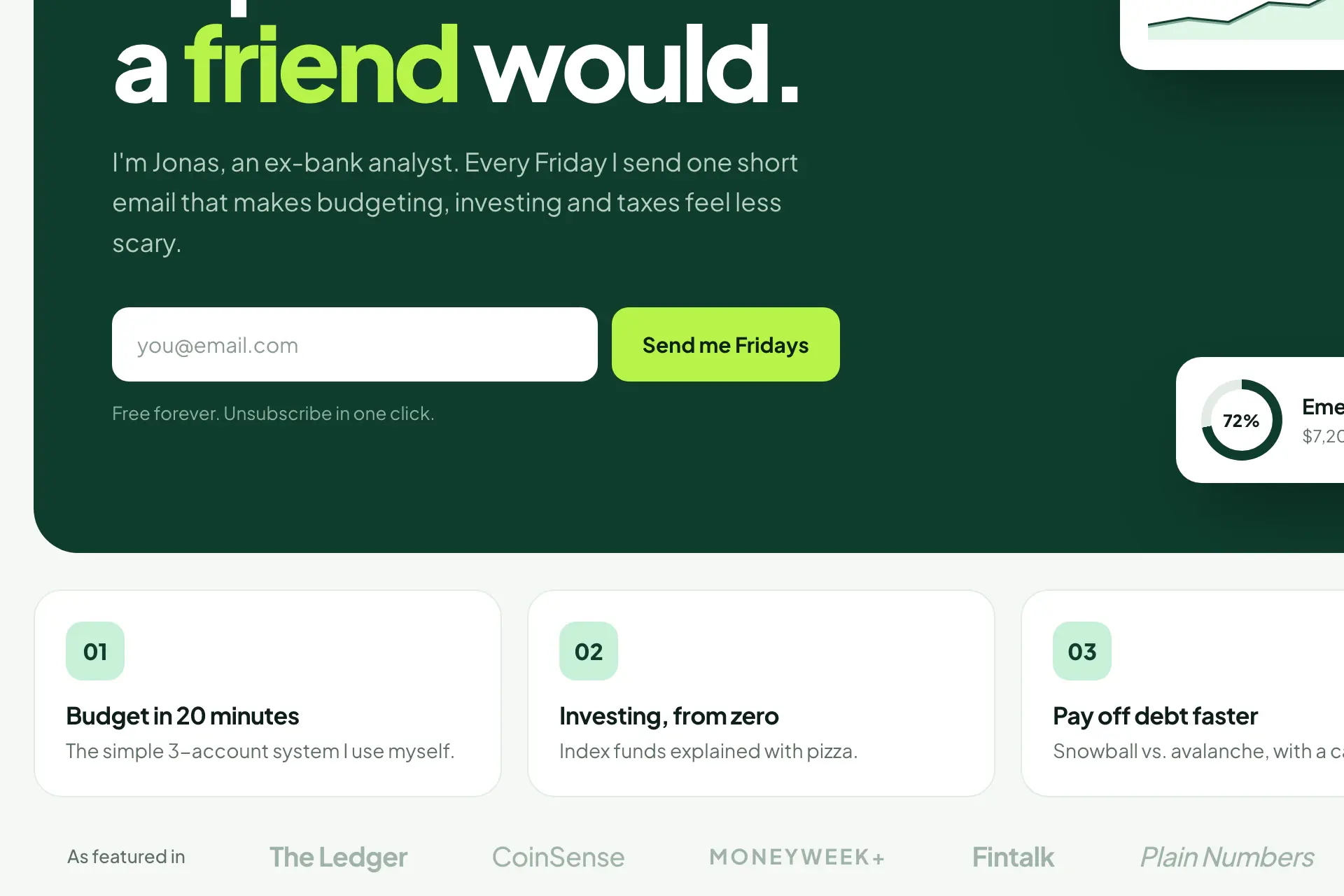
A single email capture supported by a face, a reader count and plain sample subject lines. No lead magnet stack, no countdown — the archive is the proof.
Key sections
- 01Reader-count badge
- 02Headline with highlighted keyword
- 03Inline email capture
- 04Portrait with floating finance widgets
- 05Numbered topic tiles
- 06Press strip
Style guide
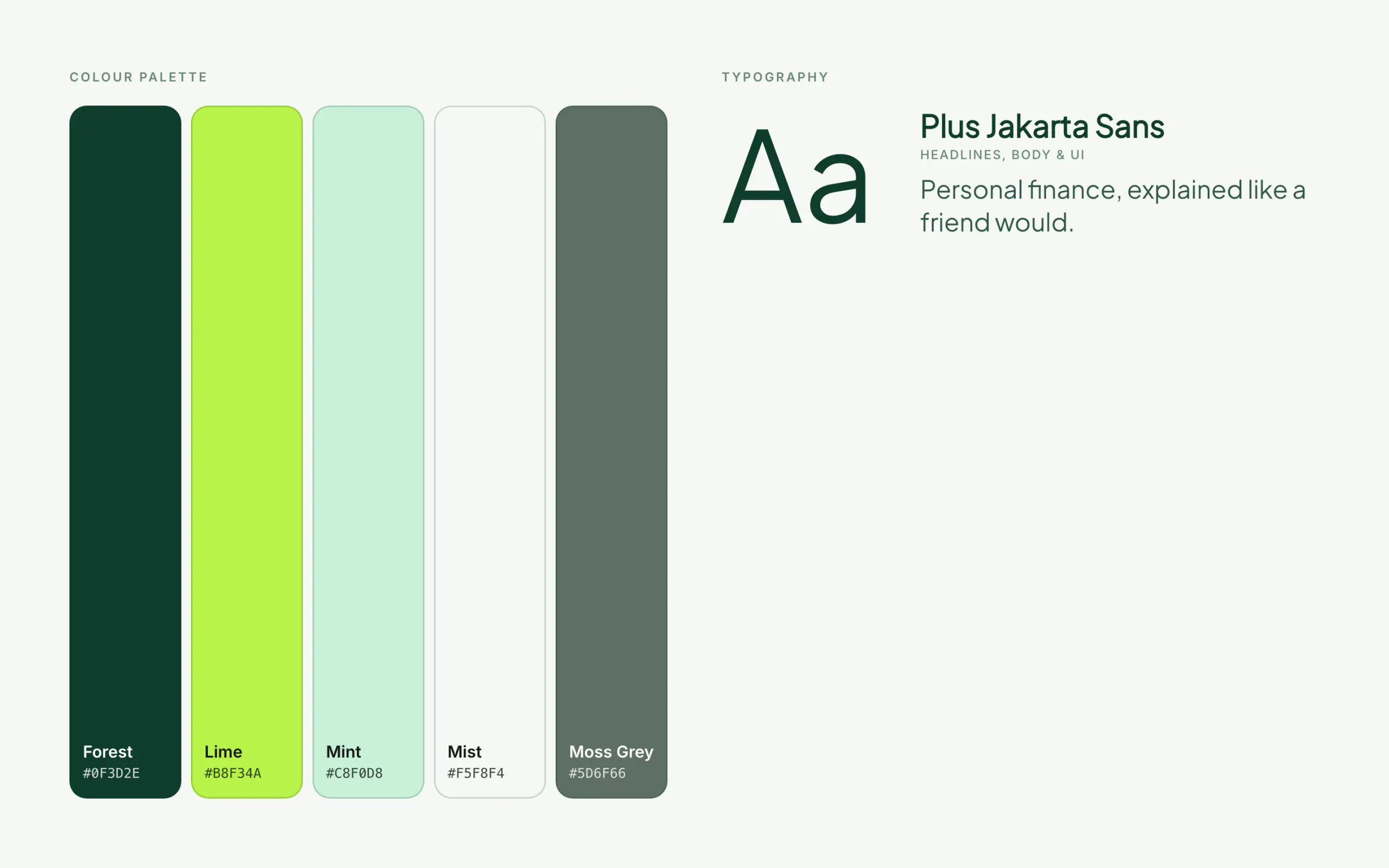
Palette
- Forest#0f3d2e
- Lime#b8f34a
- Mint#c8f0d8
- Mist#f5f8f4
- Moss Grey#5d6f66
Typefaces
- Plus Jakarta SansHeadlines, body & UI